PhysioRise - Website & Brand Identity

Context
A new London physiotherapy clinic needed a brand and a web presence that matched how the founder actually practised, performance and rehabilitation rather than generic clinical care.
Audience
London-based athletes and sports professionals looking for high-level rehabilitation.
Build
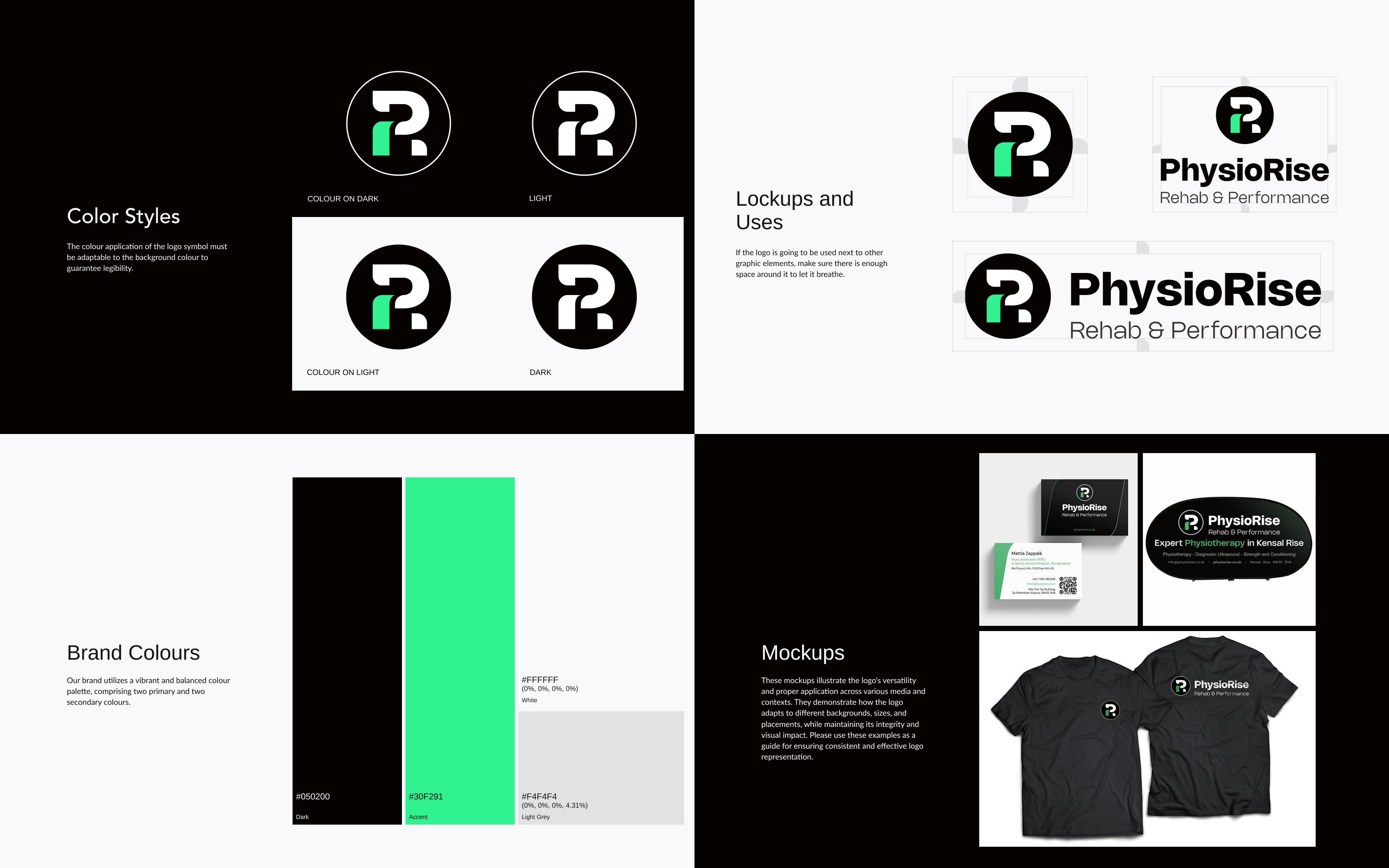
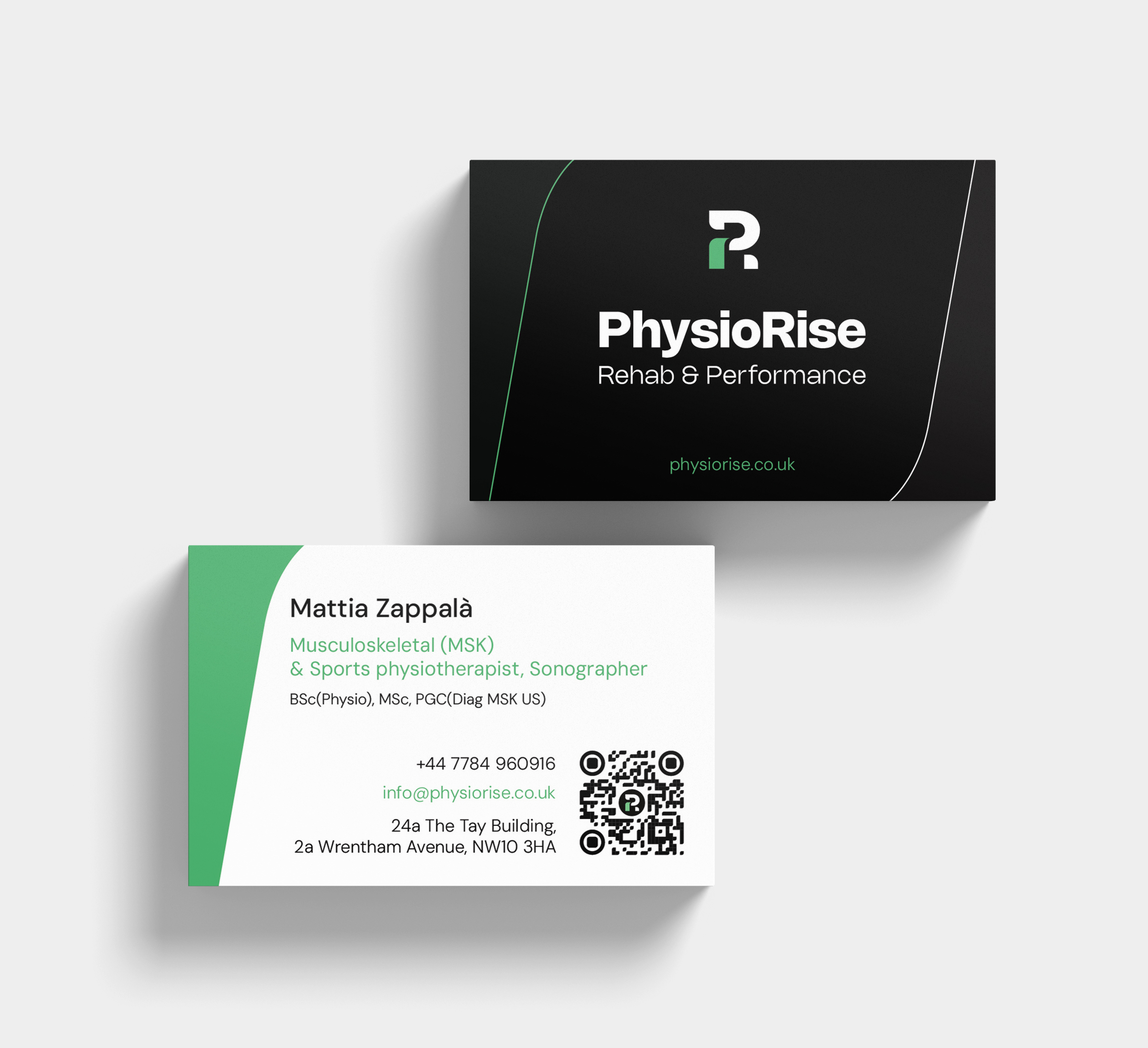
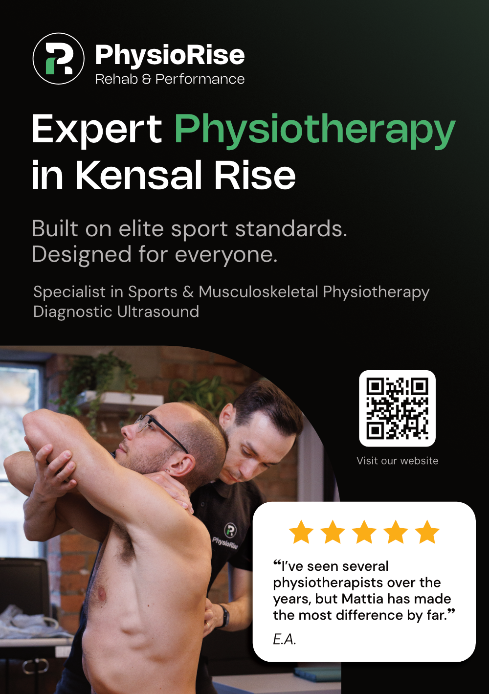
The design started from a clear problem: most physio clinics look medical and interchangeable. The aim was an identity that felt closer to sport than to a waiting room — professional, but with energy. [I / We] built a bold icon from the initials "P" and "R" to suggest movement and progression, set in black and white with a bright green accent for growth and vitality. That system carried across business cards, flyers, and signage, so the brand held together at every touchpoint.
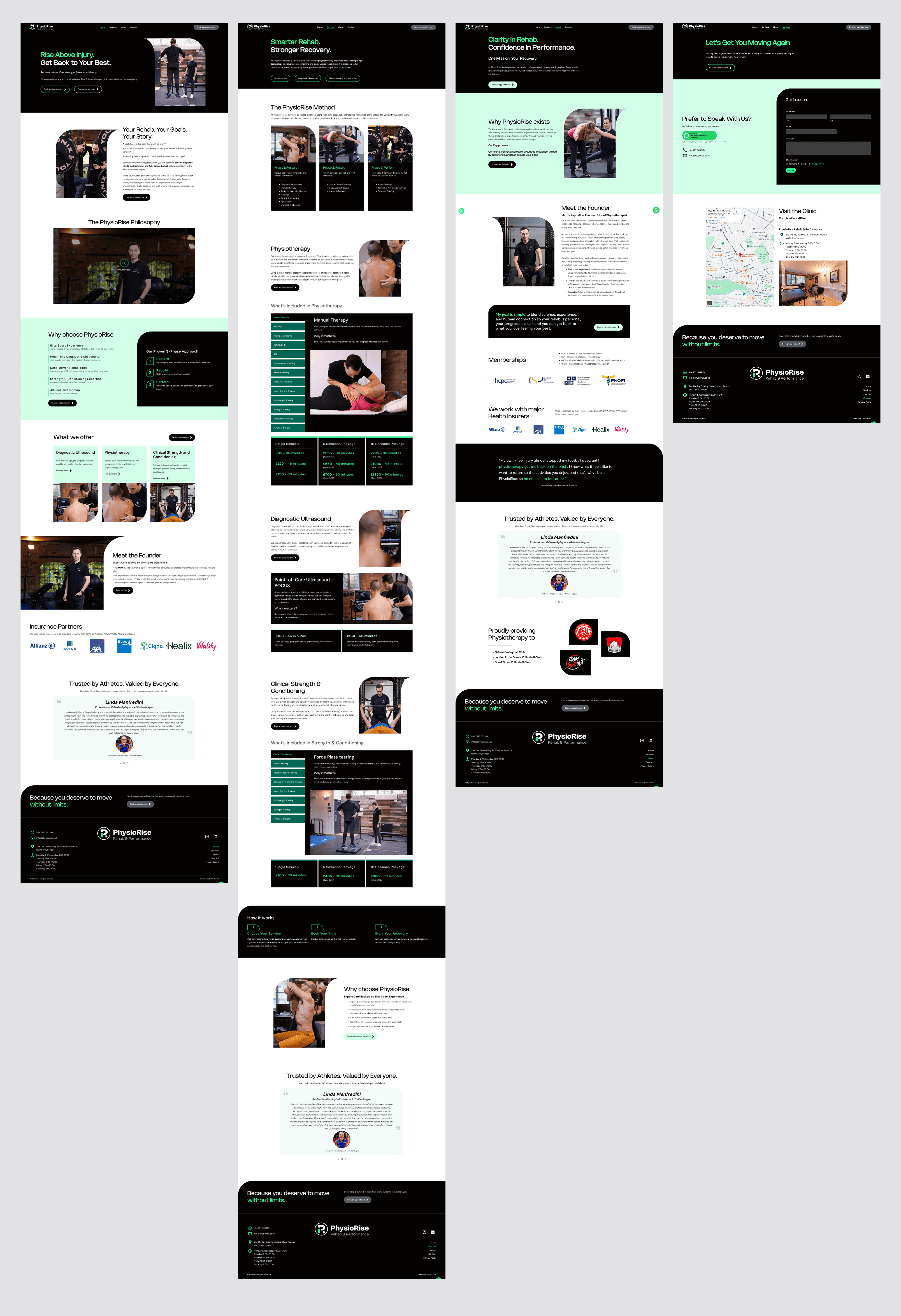
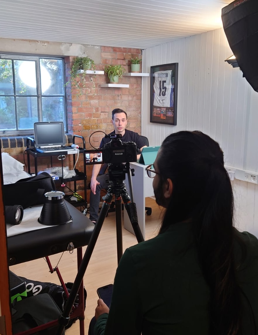
The build ran on WordPress and Elementor. It was a genuinely collaborative phase — [I / we] worked with marketing to line the design up with clear, engaging copy, and with a professional photographer on a custom shoot used across both print and digital, so the imagery stayed consistent everywhere. The site was built fully responsive from the start, since the audience is active and mostly browsing on a phone.
Outcomes & Achievements
- Attracted new clients within the first few weeks of launch — early traction for a studio that had just opened.
- Positioned the studio as a performance-oriented brand in a market crowded with clinical, interchangeable competitors.
- Established a scalable identity system that held up across both print and digital as the business grew.


More Works