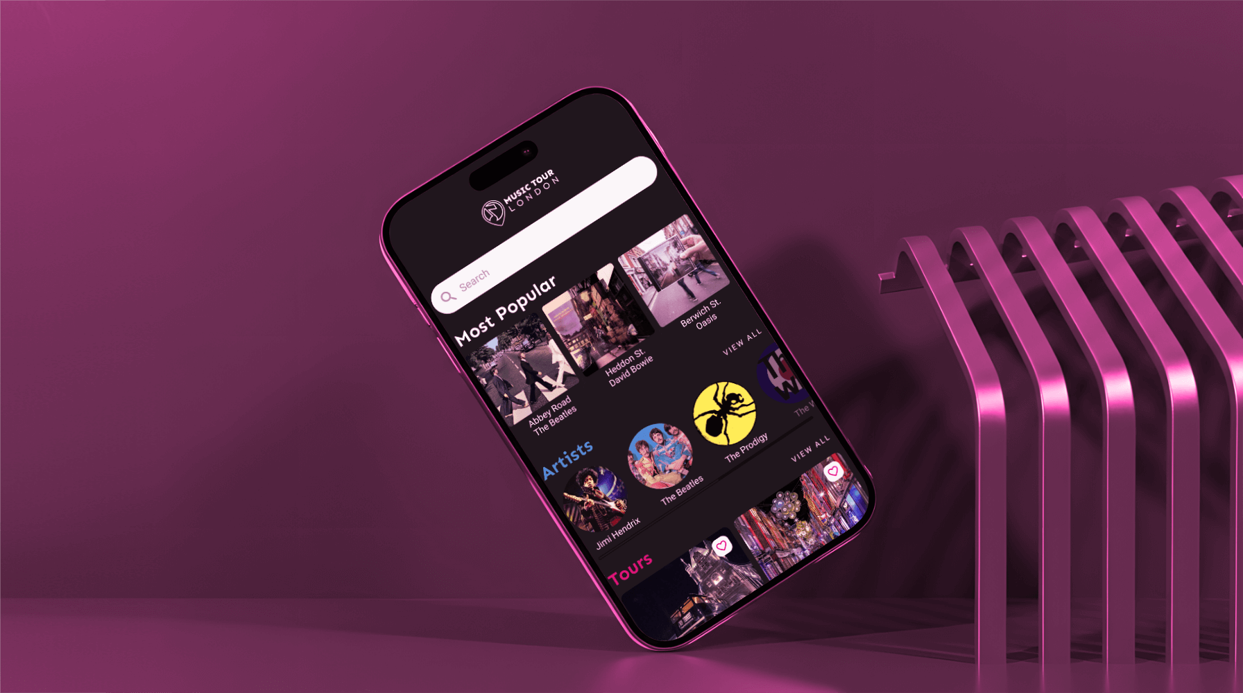
Music Tour London App
Objective
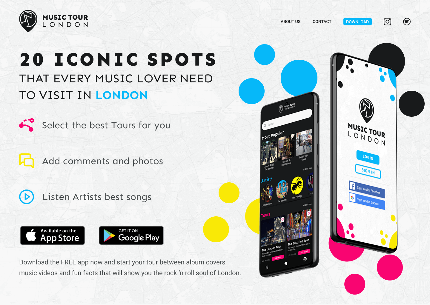
To design a simple, attractive mobile app that guides users around London's iconic music spots — album-cover locations, music-video sites — with fun facts and social features along the way.
Audience
Music lovers and travellers: a busy young professional who likes discovering new music and prefers touring at their own pace over a fixed schedule.
Design & Development Process
This was a four-week project on a UI design course with Design Lab, focused on visual craft — colour, typography, and established design patterns. I opened with research into London's musical landmarks and found a genuine gap: London is a global music capital, but there were no direct digital competitors, only pricey live tours and websites that weren't built for mobile. For visual direction I looked to the clean, dark-mode aesthetics of Spotify.
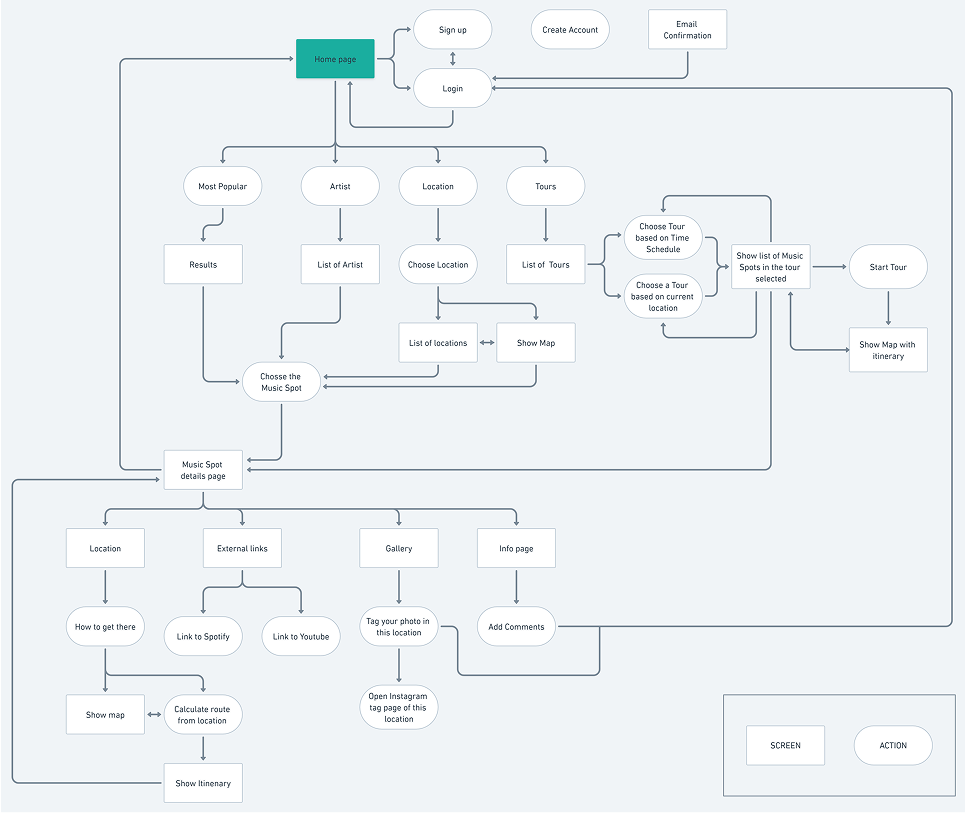
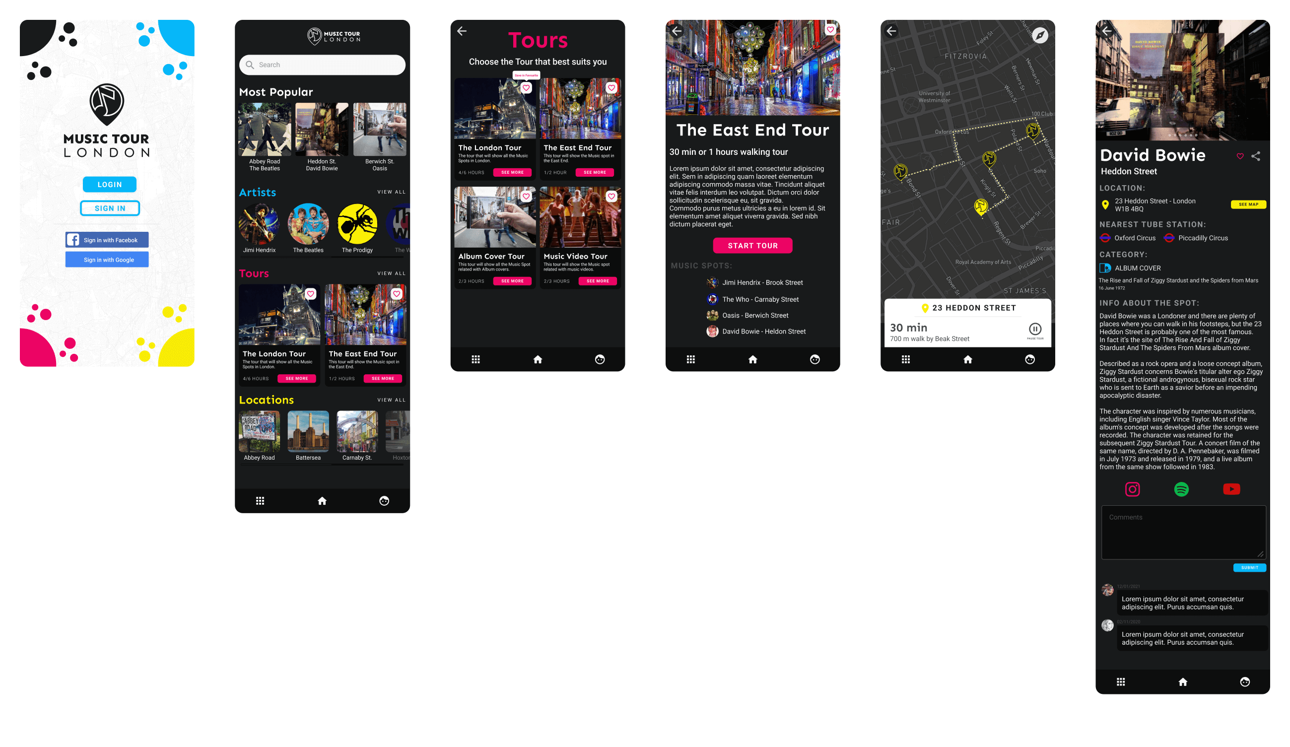
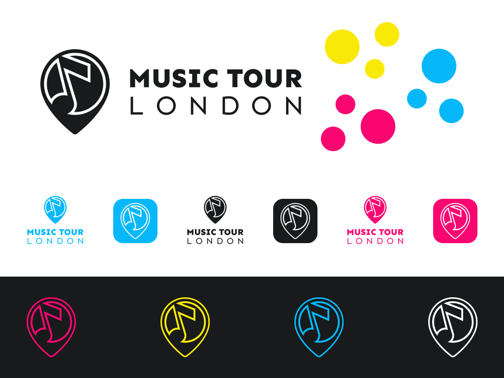
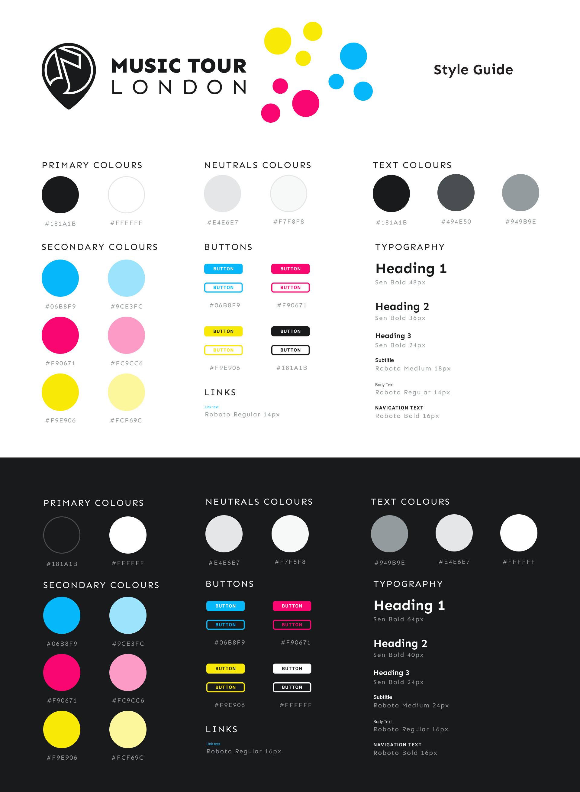
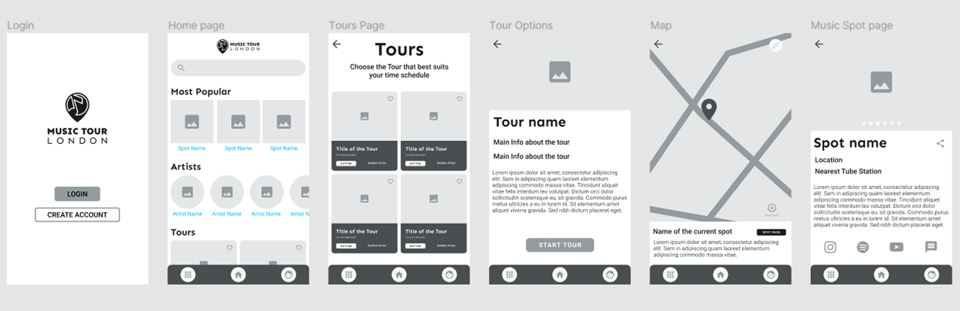
From there I mapped the structure — a flowchart and wireframes for the key journeys: login, home, tours, map, and individual music-spot pages. I designed a custom logo merging a musical note with a map pin to signal what the app actually does, then built a style guide in Figma covering both light and dark modes before moving to high-fidelity screens. To test the design, I built an interactive prototype and ran usability sessions on core tasks — signing in, starting a tour, navigating favourites. The feedback earned its keep: users called the look "trendy," but the testing also surfaced an accessibility problem I'd missed — title text set too dark to read comfortably — which I corrected.
Outcomes & Achievements
- Delivered a complete high-fidelity prototype end to end — research, structure, visual system, and tested design, not just a set of screens.
- Caught and fixed a real accessibility issue in testing: title contrast too low to read easily — a reminder that "trendy" and "usable" aren't the same thing.
- Built the prototype to a standard that could be taken forward into a live no-code build, with the structure already in place.

More Works